SHARK
START THE THRILL
Art Direction
Visual Identity
Graphic Design

Feel the Rush. Own the Ride
Born in Marseille, SHARK was forged in the world of racing, driven by a culture of speed, precision and performance.


As part of its rebranding, the brand introduced a new signature:
“START THE THRILL”. A clear promise, capturing the rush of the start,
the rider’s instinct and the intensity of every acceleration.
We designed a visual language in which this signature comes to life. A new color palette, custom typography and visuals inspired by
the vibrations that propel the shark. Enter a new era, driven by animal instinct.

We have translated the essence of SHARK into a new visual identity built around several strong principles:
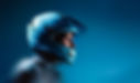
A redefined product range: To clarify and refine SHARK’s helmet lineup, we expanded the brand’s color palette. The brand’s historic blue now extends into a full gradient—from light blue for entry-level models to deep midnight blue for the most extreme helmets.
The Thrill as a graphic principle: A vertical vibration runs through the visuals, reminiscent of a shark’s sharp teeth. This pattern intensifies depending on the product and its use, visually expressing the rise in power and sensations.
The SHARKTYPE: A custom-made, dynamic, and sharp-edged typeface designed within the agency. Some letters deliberately break verticality with an italic slant, reinforcing the feeling of speed and motion. A typography that captures the energy of the Thrill.
This rebranding marks a new chapter in SHARK’s history. A more radical, more vibrant identity—true to its riders and to all those who dare.