KIPRUN
MORE RUNS, MORE LIFE
Art direction
Motion Design
Video
Born within Decathlon, KIPRUN has established itself as a major player in running. Performance, designed with and for athletes, from everyday running to competition.
To mark its entry into a new era, the brand redesigned its visual identity. BANANA supported this launch through a film revealing the emergence of a new logo conceived as an impulse.
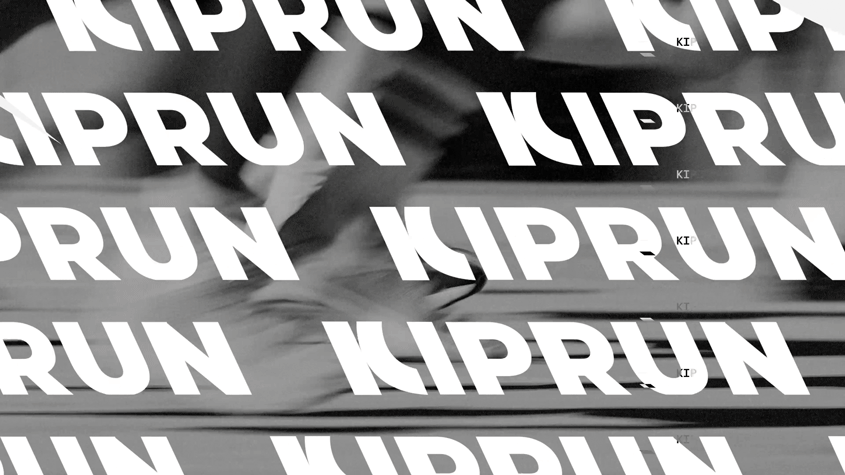
Inspired by the imagery of the starting block, the narrative captures that suspended moment when energy gathers before the explosion, driven by a bespoke sound design. The film revisits KIPRUN’s origins before celebrating its support for runners worldwide, on road and trail alike. It reveals the construction of the
logotype, defined by a −25° letter inclination, asserting a clear intention: to move forward differently.
KIPRUN, more runs, more life.